01 · Onboarding
Introducing the essentials.
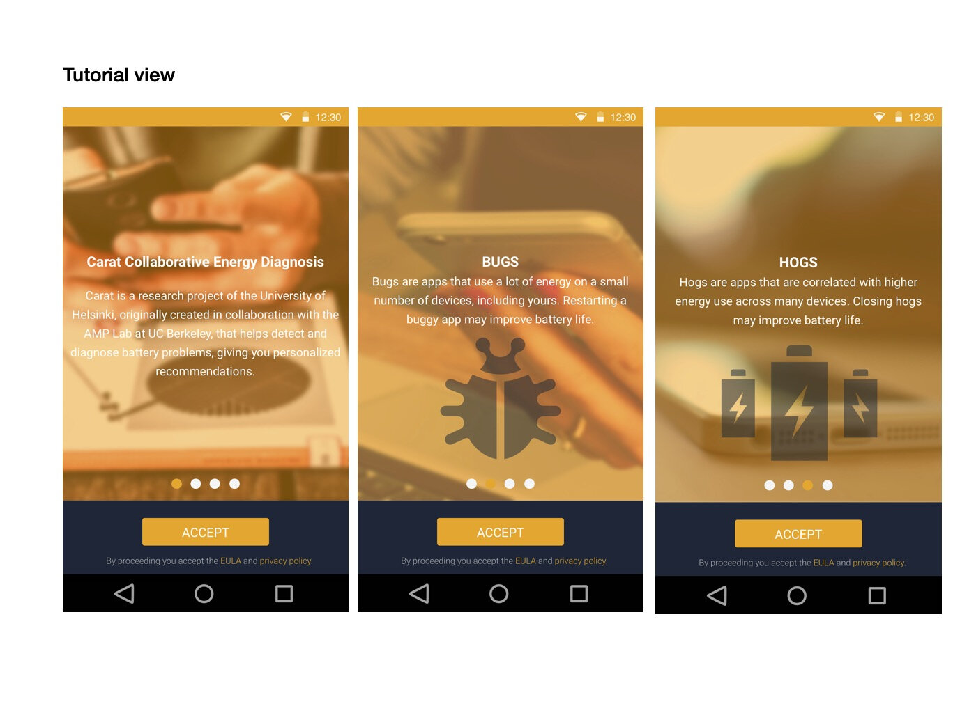
The tutorial introduces Carat and explains two key ideas: “bugs”, unusually high energy use on a particular device, and “hogs”, apps associated with higher energy use across many devices.
A new user interface for Carat, making mobile battery use easier to understand.
My role
I worked on Carat’s new user interface at Eficode. My contribution was UI and visual interface design, helping turn battery consumption data into clear views and practical guidance.
01 · Onboarding
The tutorial introduces Carat and explains two key ideas: “bugs”, unusually high energy use on a particular device, and “hogs”, apps associated with higher energy use across many devices.
02 · Dashboard & device
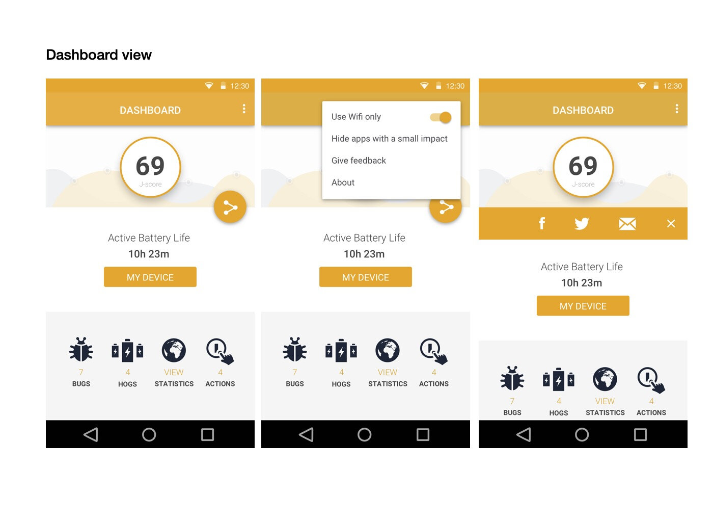
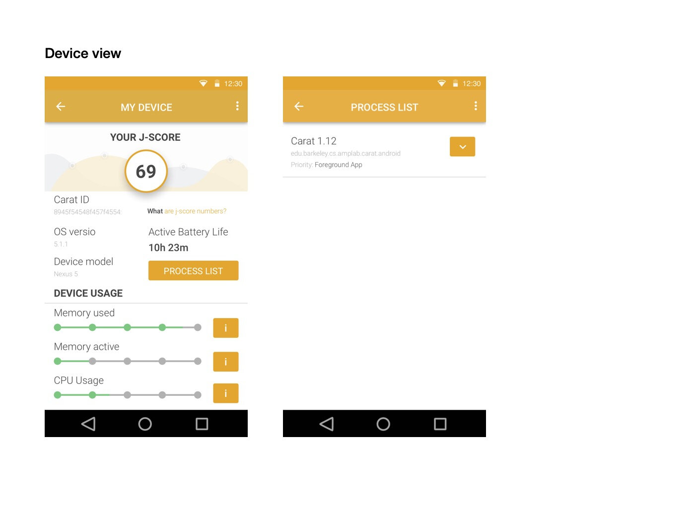
The dashboard brings battery life, the comparative J-score and report shortcuts into one view. Device screens provide more detail, including memory use, CPU usage and running processes. These design views show the path from a quick overview to a closer look at the device.
03 · Release context
The University of Helsinki announced Carat 2.0 with a renewed interface, global smartphone energy-efficiency statistics and more detailed energy-saving advice. The screens here present our interface design work, from the first introduction to the dashboard and device details.